Version 2 is now live!
New theme, new features and new content coming soon!
It's been a while, huh? Life has gotten in the way but the blog is finally back with a fresh new coat of paint!
Yeah yeah, I know. You may be wondering: "It's been only a few months since you launched this site, and now you think it's the time to re-work it after only three posts to relaunch it again?" And that's right! I have learned and discovered few things that made me re-work this project, and here we are.
Later I'll write a deep dive guide on how to create your own self-host newsletter/ghost just like this one, so stay tuned. Right now, this issue explains the changes made for the new juanca.org and the process behind it.
What happened to the old theme?
This blog originally launched using a modified version of the Edition theme. I gotta say, it's a pretty good theme to get started, but I wasn't really satisfied with the results. Let's take a look.
Edition is a good looking theme, but it has his flaws. The first one is the very first thing that you see after opening the homepage.
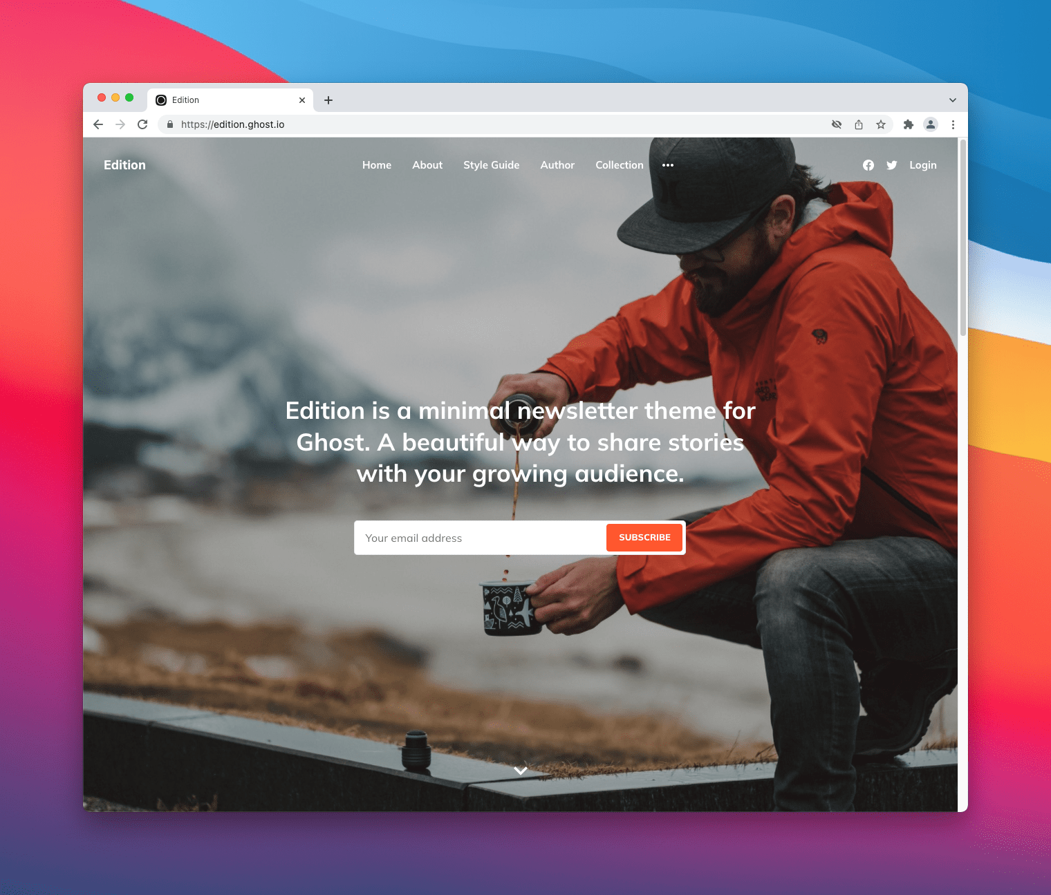
As you can see, for a blog, a glaring flaw is asking right away for your email address even though the visitor hasn't read a single issue yet. It's a little bit too aggressive for me, I'd rather present the visitor my latest issue or a featured one first.
If the user hasn't left the page yet... now we have to tackle technical issues, specifically performance and accessibility.
After running a new session on Chrome's Lighthouse, we get the following results on mobile:
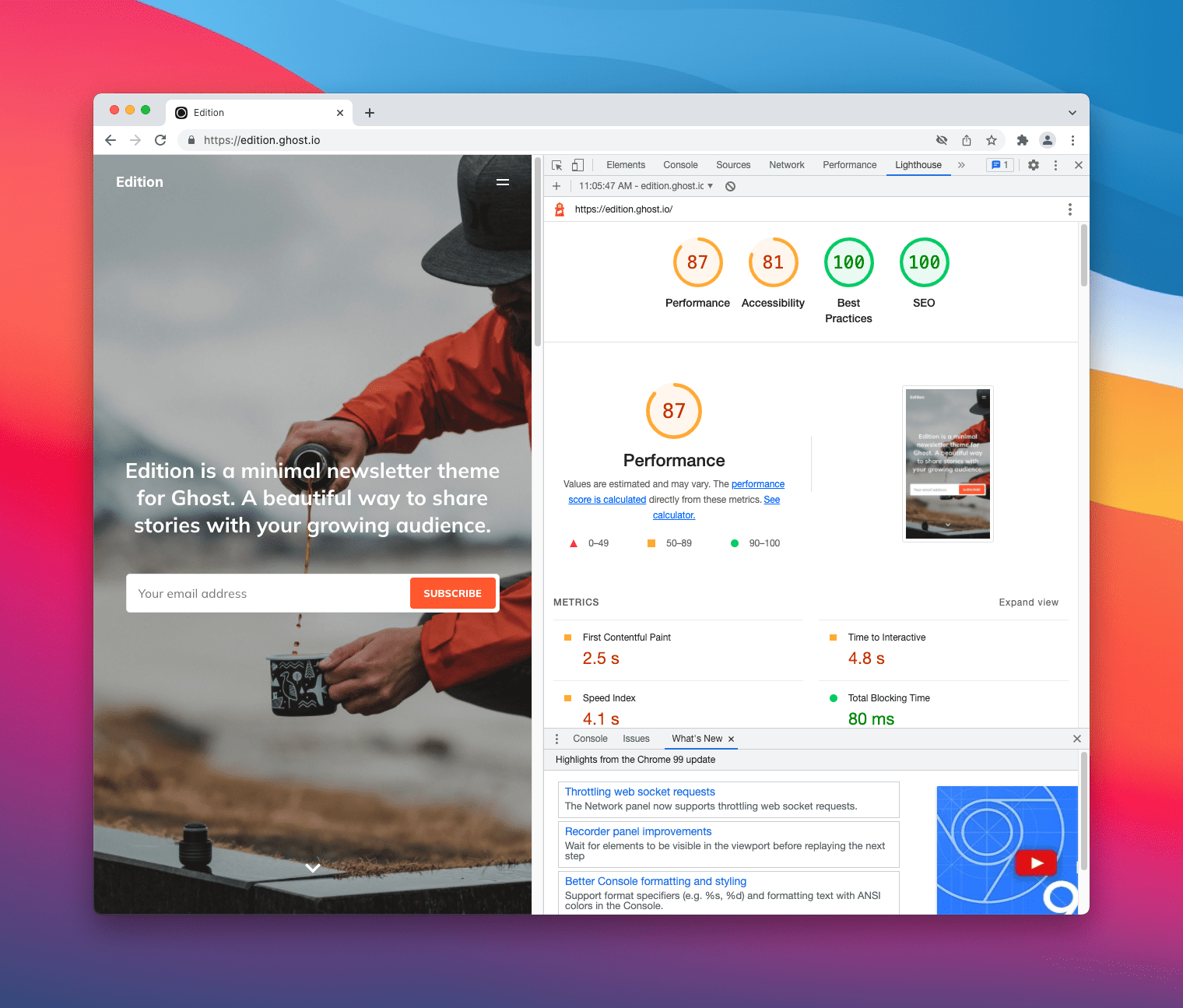
And on desktop, we got a little better results:

The results are alright, to be honest. Performance is likely to be poor because of the images (the big cover image is an issue). And accessibility is meh because of poor contrast and a small font size.
I wasn't satisfied with this theme. I even was thinking about reinventing the wheel and creating my own theme from the ground up, but then...
A new theme: introducing "modified Journal"
On August 16th, 2021, 4 months after I launched this website, Ghost introduced brand new and free newsletter themes:
We've shipped three brand new Ghost themes for newsletter creators that are ready to use today for free.
Journal, Digest, and Bulletin are the latest official themes to be added to the Ghost theme marketplace, each with slick purpose-built designs suitable for newsletters.
Combined with the native membership and subscription features, it's possible to launch a free or premium newsletter using one of these themes in just a few clicks.
All themes are fully open-source, free, and extensible, available on our Marketplace, and the source is on GitHub.
So I decided to check them out, and oh boy, I fell in love with the Journal theme.
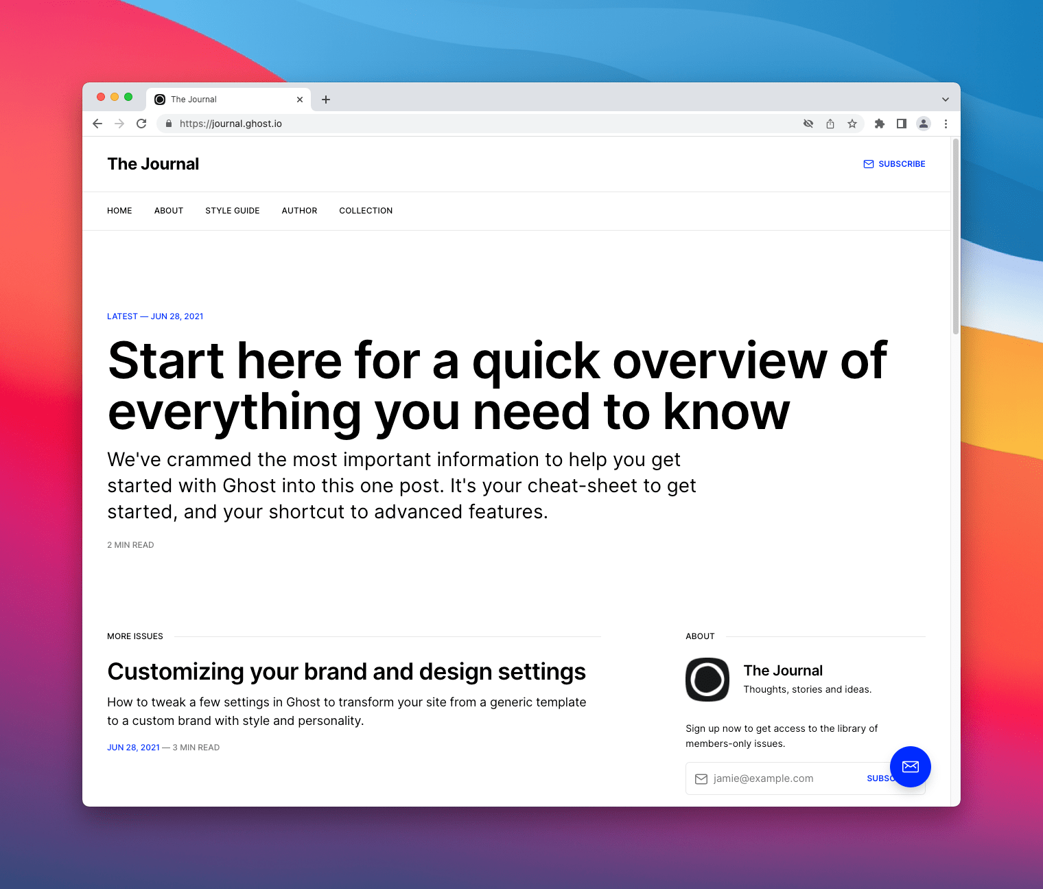
It has basically everything that I wanted from a Ghost theme. Simplicity and good design. From the homepage, topics and posts. Also, a non-aggressive CTA telling you to subscribe. Pretty nice!
But Chrome's Lighthouse strikes again:
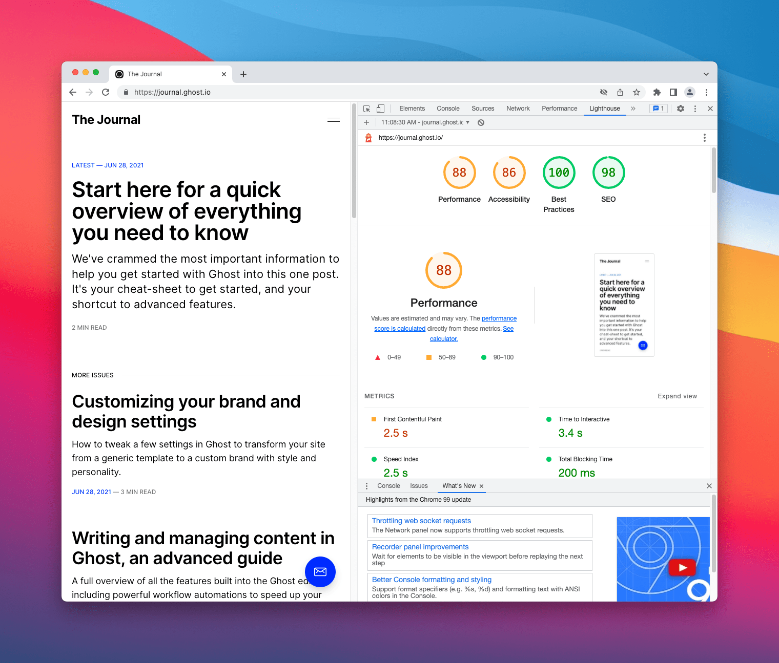

Lighthouse results on Journal homepage.
It has similar problems as the previous theme, but I really liked the theme. Thankfully, as mentioned before, the theme is open source... so I decided to fork it.
I'm not gonna get into detail on what I modified to get better accessibility and performance. For that, you can check the changes on my fork.
But long story short:
- Performance. Minimize JavaScript files, upload good enough compressed images and use a good VPS. Right now, I'm using the $5USD Intel Basic Droplet from DigitalOcean.
- Accessibility. Increment font size for various elements, add aria-labels and change the
--color-secondary-textto#666666, basically a darker tone for better contrast.
And well, the results speak for themselves:
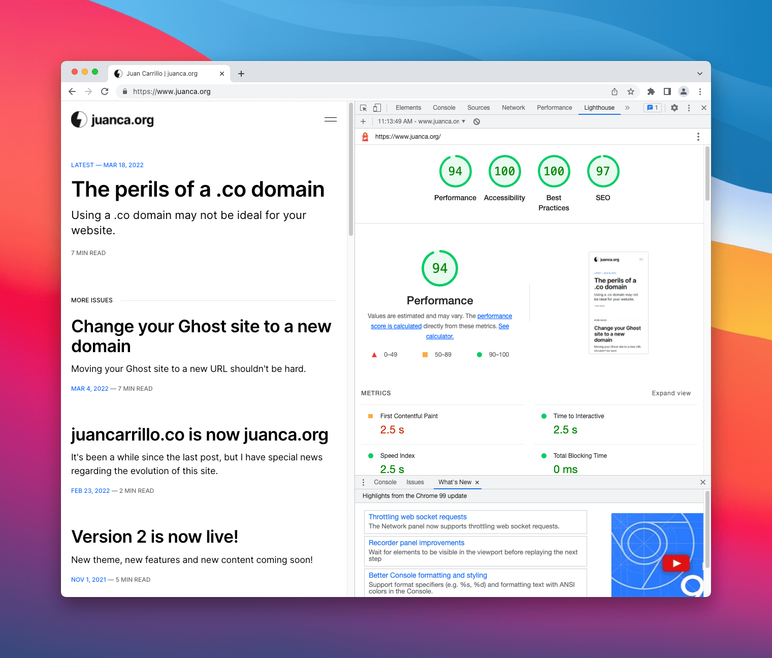

Lighthouse results on custom Journal homepage.
All results green, let's go! 🚀
New features: analytics and subscriber signups
Google Analytics is overkill for most of my work. I don't really need the myriad of features and tracking options that Google offers: OS version data, behavior flows, content drill-downs, exit pages and all of that.
Here are questions that I want my analytics software to answer:
- Is my site growing or trailing off?
- How many people are looking at my site right now?
- What pages are people visiting?
- What sites are they coming from?
Also, keeping in mind the privacy of all my visitors.
Introducing Simple Analytics
Simple Analytics is a really good alternative from Google Analytics.
It shows the essentials: page views, referrers, top pages, and screen sizes. It doesn't use cookies or collect any personal data. It includes a native iOS App when you don't want to open the web dashboard and if you are a student, you can get one year for free with the GitHub Student Developer Pack. Or you can get one month free by using this link.
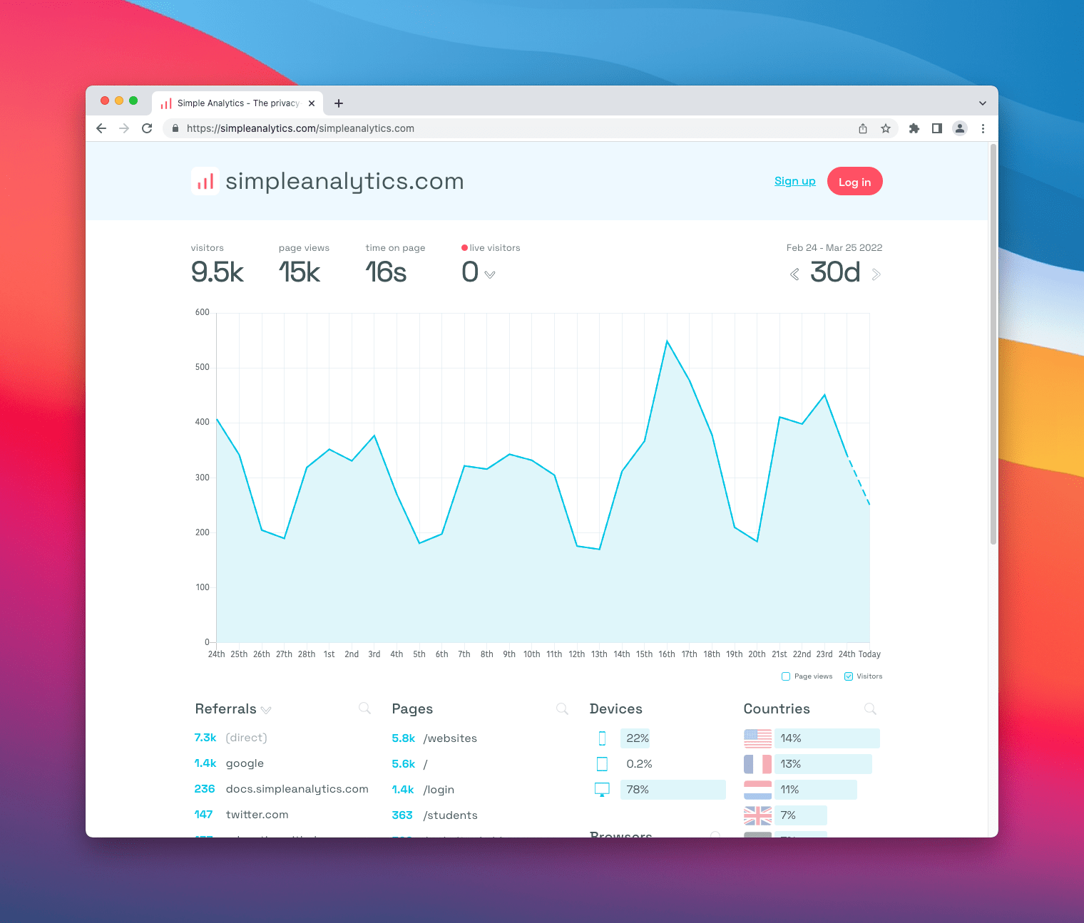
With that, it's basically the best option for myself and I decided to go with it.
If you are not satisfied with this service (pricing, dashboard or anything else you don't like), I would recommend trying out Plausible or Fathom Analytics.
Subscriber signups
Inspired by the same platform that powers this site, I'm opening up subscriber signups. As you may know, social networks go in and out of fashion all the time. Email addresses are timeless. Let's try it out!
If you are interested on this type of content (technical, analytical), don’t want to miss out on the latest updates on my work and stuff that I have learned, subscribe. No spam, unsubscribe as your heart desires.
That's pretty much it. Gotta say that I'm pretty satisfied with the results and the process, hope you enjoyed reading about it.
As always, thanks for reading!
